Design 101: Creating Great Advertising Without a Graphic Designer – Part 2
Last week we shared some tips on how to create eye-catching advertising even when you don’t have a graphic design team at your disposal. This week, we have three more designer’s tricks for you to make the most of your advertising dollar!
Trick #4 – Make it Colorful, but Not Crazy
It will come as no surprise that bright colors catch your viewer’s attention and using bold, primary colors is a great way to make your message standout. However, this is another case where less is often more. Many novice designers tend to go a bit overboard with their color usage, oftentimes creating advertising that looks as though it would be more at home in a circus, than in a trade magazine. But that does not mean that you cannot use more than one color! Utilizing only one or two bright colors in your print and web advertising, you can not only get your message noticed, but still create a harmonious and cohesive advertisement.
If you are unsure of which colors would be best for your project, there are several great online resources that can create color palettes for you to use! Sites like Color Scheme Designer and Color Schemer create online color palettes that you can adjust using the basic principles of the color wheel. On other sites, like CSS Drive’s Colors Palette Generator and Color Palette FX, you can use your photos, or photos you find online to create color palettes.
Trick #5 – Use Eye-flow Patterns to Maximize Your Impact
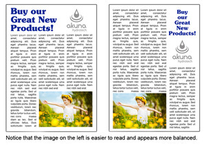
Generally speaking, viewers interact with advertising in the same manner as they would with a book. In Western nations, we read text starting in the upper left corner of the page and then flow downwards, moving left to right. This indicates that anything, be it a headline or an image, that is placed in the upper left corner of your advertisement will garner the most attention. Reserve this space for the image or text that you will use to catch your audience’s attention, placing secondary images or sub-headlines lower on the page.
Being aware of natural visual flow tendencies is extremely important when creating advertisements and web pages. Viewers easily identify when something makes them uncomfortable, or makes reading the information difficult. While, they may not always be able to articulate what the problem is, most will simply stop reading, rather than struggle through a poorly laid out advertisement.
Trick #6 – Your Images Have Motion and Weight
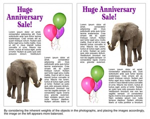
Proper image placement is essential to creating an overall flow for your advertising design. Understanding and properly utilizing the weight and motion of images is one area that many novice designers overlook. When your images feature people or items displaying motion, it is important to have them “look” into the center of the page. If you place an image of an individual looking to the left on the left side of your page, it appears that your subject is looking off the page, at something that is more interesting than the text it is intended to support!
Additionally, images that display items that have weight (cars, computer equi
pment, or even images that have solid looking bases) tend to make the most sense to the viewer when they are placed near the bottom of the page. Similarly, images of light objects (balloons, small office supplies, or clothing) are best placed near the top of the page, particularly if they are used in conjunction with “heavier” images.
Creating effective advertising can be a daunting task, particularly when you are a small company without a dedicated design team. However there are great resources, both online and in print, as well as our six tricks, to help you on your way!


