Design 101: Creating Great Advertising Without a Graphic Designer
For many companies, advertising is one of the single greatest expenditures that comes with running a business. Larger companies often have the advantage of working with a dedicated team of graphic designers who can focus their complete attention on how to best represent their company’s brand initiatives. However, if you don’t have the luxury of having a designer at your beck-and-call, you can still produce outstanding advertising using a few simple tricks.
Trick #1: The Billboard Theory
Next time you are driving, take a moment to notice the billboards along your route. You’ll see that they almost always have two things in common – large pictures and minimal text. When your potential customers are cruising past your billboard at 65 miles-per-hour you don’t have a lot of time to get their attention. You need to make your point quickly. But this advertising technique doesn’t stop at billboards, because often people glance through trade magazines or sort mailing at a quick pace too! That means you only have a few moments to catch your customer’s attention and make your point.
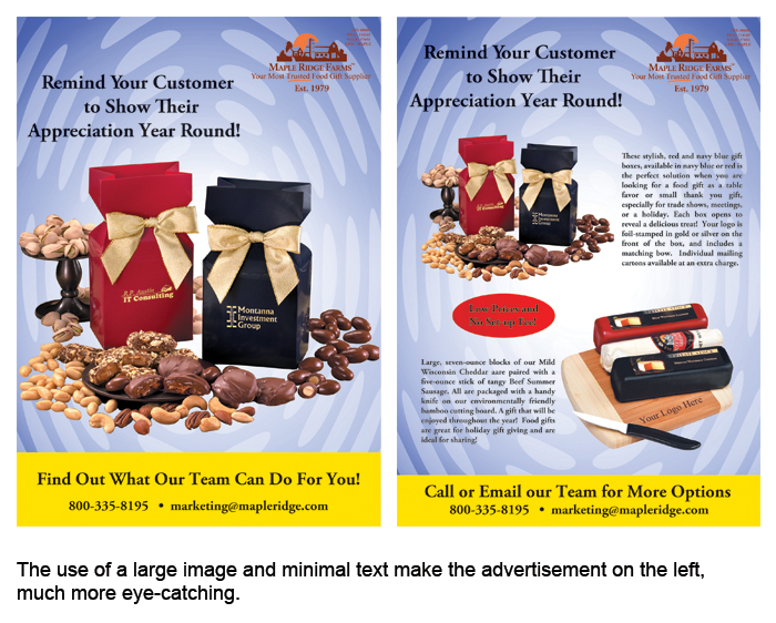
Current graphic design trends indicate that advertisers are focusing on large pictures to sell their products. More and more, companies are showing customers what they have to offer and then referring them to a catalog or website for more details. This technique is successful for two reasons: first, it shows your customer the product you have to offer in all of its high-resolution glory, and second, it pushes the customer to interact with your company by asking them to look at additional resources that you have provided to them, like a catalog or a website.
Trick #2: Use Your Fonts Wisely
When you only have a few moments to capture your potential client’s attention, it is important to make sure that your message is clear and easy to read. Your choice of fonts can be either your biggest ally or your worst enemy in achieving this goal. Often, novice designers think that the easiest way to capture the viewer’s attention is by using a lot of big splashy fonts. While this technique is great for a headline, it’s not always the best idea for the body of the text.
It’s also important to remember that when using various typefaces, more isn’t always better. In fact, it’s often times much worse. As a general rule of thumb, most print advertising relies on delivering its message using three fonts or less. This gives the finished piece a better general flow and a more minimalistic appearance, both of which are great things if you only have your viewer’s attention for a few moments.
Trick #3: Make Your Text a Graphic Element

So, by now I imagine that many of you are saying, “But I need to put more than just a headline on my ad!” which, in some cases, is a completely valid point. When you do need to include a large body of text, such as a product description or offer terms and conditions, it’s important to try to make the text look like a graphic object. This means trying to group your text into easy to read tidbits, like bullet points, or justifying your paragraphs so that the text looks more like an object and less like a series of separate entities. By utilizing blocks of text, you can still give your advertising a clean and organized look, while including the text you need.
We all know how important it is to get new customers, and effective advertising is a great way to draw in new clients. However, many companies do not have the resources to have a dedicated art staff to create ground-breaking ad campaigns every time they need to advertise a new item. The good news is that you do not need to be an artistic genius to create great ads! Just keep in mind these few simple tricks and you’ll be well on your way to advertising success.
